
(click on image to enlarge)
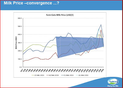
Note: I enlarged the section (11/06/10) to show the detail better. U.S. is the green line and NZ the red line.
Take a close look at the above graph. Where is New Zealand's farm milk price relative to the U.S.? The above graph by Fonterra does not show 2010 but, it is higher for NZ.
No comments:
Post a Comment